Wednesday, June 24, 2009

Desafinado


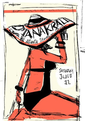
Just finished a poster for the Atlanta Symphony Orchestra.  The artist is Diana Krall who just released an album of Bossa Nova covers, so I tried to bring a little breezy Brazilian feel to it.

These are the sketches I sent, two beachy ones and a third of stacked pianos. I was thinking about a crazy party I went to years ago in Oakland. It was in a huge warehouse and they had stacked pianos five and six high to form all the walls.

Friday, June 19, 2009

TWO HEADZ ARE BETTER THAN ONE?


Oskar and I were using his washable markers to make all kinds of drawings.  IT got me thinking about how hard it is to draw kids. I drew a couple dozen kids heads and these two are about the least scary of the bunch.

Wednesday, June 17, 2009

FUNKY CHADOR


Ubiquity Records asked me to submit a few new t-shirt designs for their Fall 09 line. It remains to be seen which one will be chosen, IF ANY, but either way it was fun to do. Have to say though, if they don't pick up the FREE THE FUNK one, I'm gonna have to learn to silkscreen.

Tuesday, June 9, 2009

SNAKES and OTHER NOBLE creatures


I was cleaning up some files on my computer and came across these sketches. This is the only other job that I have done thats been killed by myself or the client. It was a poster for an Andrew Bird concert, right when he was releasing his new Noble Beast album. The booker had a say in content and felt my style wasn't quite right for Mr. Bird. Couple fun ideas here that I may use again for other things. Particularly the timeless dude who walks on the boardwalk with his pet snake. Hampton Beach 1986 holla!

Monday, June 1, 2009

TRAINWRECKED


One of the toughest type of clients are the ones who don't usually work with designers or illustrators normally. Often they don't know what they want until they see it.  Here is an example for a client who wanted artwork to wrap a mobile food service truck.
 I was excited by the idea of having a 14 foot truck covered in my artwork, cruising around Manhattan.  After much back and forth, the client wanted a copy of an existing stock sign of a rooster and the job entailed quite a bit more than was originally agreed upon and the project was killed. Below are the first two rounds of concepts/designs. The final was a version of the rooster not shown here.